
Mnet has revealed the redesign of its channel following the “Produce 101” controversy.
It was recently reported that after the network’s image was hit hard by the vote manipulation controversy involving Mnet’s shows including all four seasons of “Produce 101,” Mnet was taking steps to rework its brand identity. The channel was particularly facing backlash over its “We Are K-pop” slogan as fans questioned whether the network had the right to make such a claim following the confirmation of vote manipulation in its K-pop survival shows.
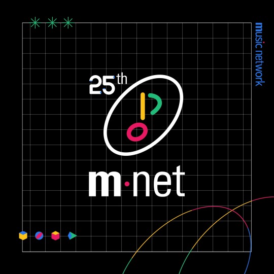
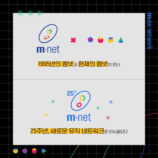
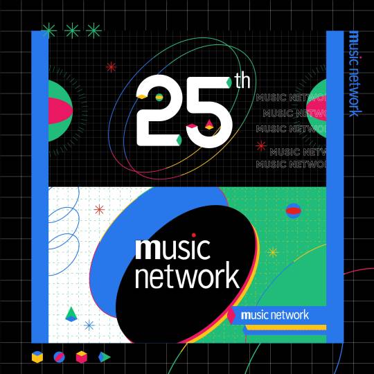
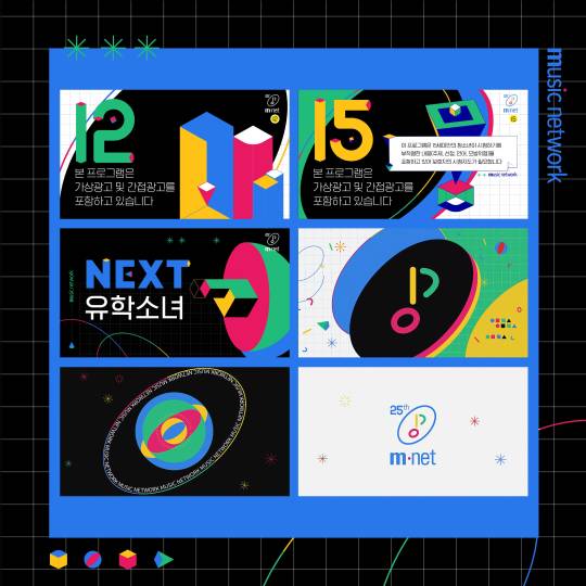
On February 24, Mnet revealed its “Channel Design Renewal,” showcasing its new look that is based off the network’s original logo and celebrates the channel’s 25th anniversary. The design includes the text, “Mnet of 1995 and Mnet of today meet.” It also reads, “For the 25th anniversary, a renewal as a new music network.”
source: @soompi,soompi, MnetKR
no subject
Date: 2020-02-26 07:34 pm (UTC)(To mnet not you op!)
no subject
Date: 2020-02-26 11:05 pm (UTC)that said i like the aesthetic.
no subject
Date: 2020-02-27 04:13 am (UTC)no subject
Date: 2020-02-27 09:56 am (UTC)no subject
Date: 2020-02-27 02:53 pm (UTC)